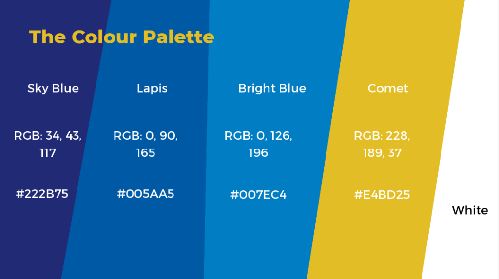
Our distinctive color palette embodies Aflatoun International’s professional yet approachable identity, reflecting our commitment to empowering children and youth through social and financial education. This refined selection of four carefully chosen colors creates a cohesive visual language that speaks to trust, growth, innovation, and optimism across our global network.
Sky Blue represents the limitless potential and aspirations we nurture in every child, while Lapis conveys the depth of knowledge and wisdom we help young people develop. Bright Blue embodies our forward-thinking approach and the clarity of our educational mission, and Comet (our vibrant yellow-gold) symbolizes the bright future and golden opportunities we help create for children worldwide.
This streamlined palette ensures consistency and recognition across all materials while providing enough versatility to create engaging, professional communications that resonate with educators, partners, and stakeholders in our 116+ partner countries.
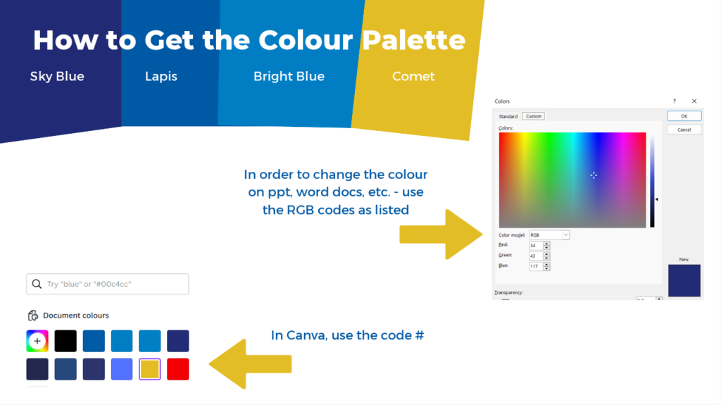
Technical Implementation:
- For digital applications (Canva): Use the hex codes (#)
- For print and Microsoft Office applications: Use the RGB values
- Maintain these exact color specifications across all brand materials to ensure consistency
Important: Only these four specified colors may be used in Aflatoun International materials to maintain our distinctive brand identity and professional appearance.


| Title | Summary | Last Modified | Downloads | Link |
|---|---|---|---|---|
| Aflatoun Branding Guidelines | The Aflatoun Visual Guidelines PDF is the comprehensive master document that establishes all brand identity … | October 6, 2025 | 28 | |
| Aflatoun Brand Colours | Technical Implementation: For digital applications (Canva): Use the hex codes (#) For print and Microsoft … | September 30, 2025 | 4 |
